
Overview
What is Edge Maestro - Octopus?
The Octopus platform by Eaton is an edge device management solution for substations and energy infrastructure, used by operators and energy suppliers. It offers centralized monitoring, configuration, and control of edge devices, enhancing efficiency, performance, and security.
*Launch in 09/2024
*Contact for full case study
Time
05/2024-09/2024
Role
UX Design Intern
Team
2 UX designer
3 Product Manager
1 Project Owner
5 Developer
Responsibility
UI/UX Design
User Research
Design system
Target Audience
Who are our users?

Operators
Operators who need to manage their Edge Devices and associated applications.

Energy Suppliers
Energy suppliers who are responsible for configuring and maintaining these devices.
Architecture Overview
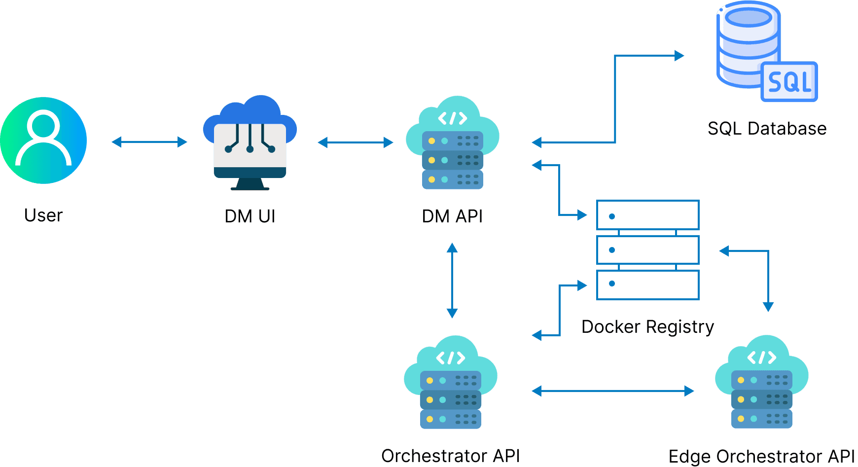
Ecosystem of Edge Maestro - Octopus
This is the ecosystem of components used for collaborattion across layers to manage devices. The UI, built with React, allows users to manage devices, while the DM API supports both the UI and external operations, with data stored in an SQL database. The Orchestrator API handles communication with edge devices for updates. Applications and configurations are stored in a Docker registry and deployed via Docker containers, enabling modular and flexible management.
Feature Map
Features from PRD
My contribution
Edge Maestro - Octopus
Edge Devices
Device Tagging
Device Type
Device Location
Deploy / Add Device
Apps
App Details
Deploy Apps
Import new apps
Firmware
Group Actions
Updates Edge Devices
Firmware management
Packages
Searching for Packages
Package approval
Building Packages
Package States
Admin
Settings
The contriibution that I want to highlight
Package Management
Definition
What is Package Management?
Package Management involves managing collections of applications and their configurations to be deployed on edge devices or device groups, ensuring consistency and simplifying the process of managing large fleets of devices.
The relationship between the two target audiences
Operators and Energy Suppliers in Package Management
In the package management feature, operators are our primary users. They can duplicate, modify, and build new packages. However, after an operator builds a new package, it must be submitted to the energy supplier for approval. If there are no issues with the package, the energy supplier will approve it, allowing the new package to be put into use.
Operators
Operators who need to manage their Edge Devices and associated applications.
Build and Submit Package for approval
Approved or Reject
Energy Suppliers
Energy suppliers who are responsible for configuring and maintaining these devices.
Operators is the main user of package management, So let’s focus on Operators!
Operators
Operators who need to manage their Edge Devices and associated applications.
User need #1
As a Operator, I want...
Operators
I want to easily manage my packages by viewing their status and deployments, while also tracking the number of applications in each package and their deployment history. I also want to build new packages and filter content, helping me streamline my workflow and make informed decisions.
Workflow of Operators
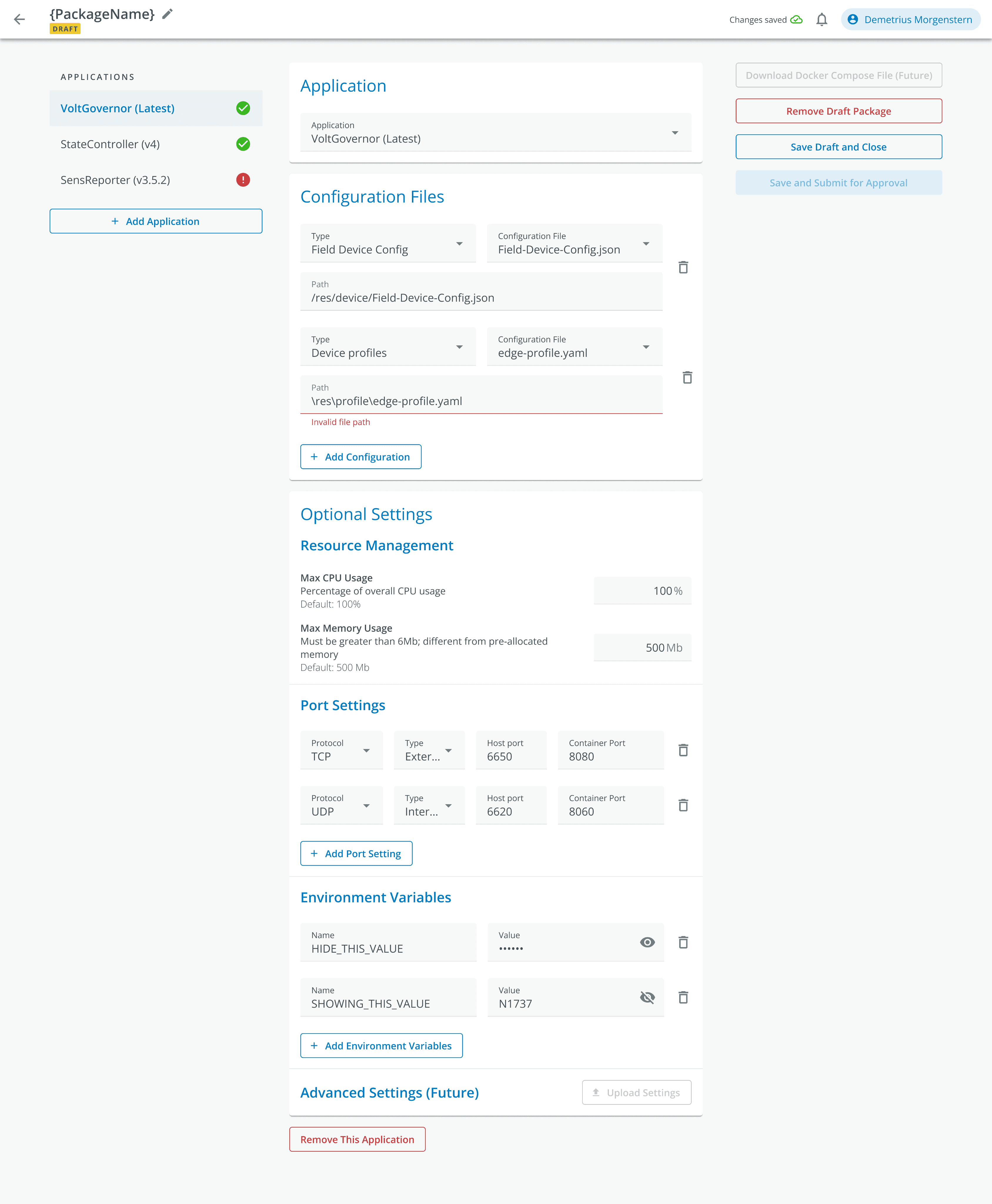
Packages
Add application
and settings
Submit for approval
Save and Exit
Remove Draft Package
Duplicate Package
Build Package
Archive Package
Design
Initial design and feedback
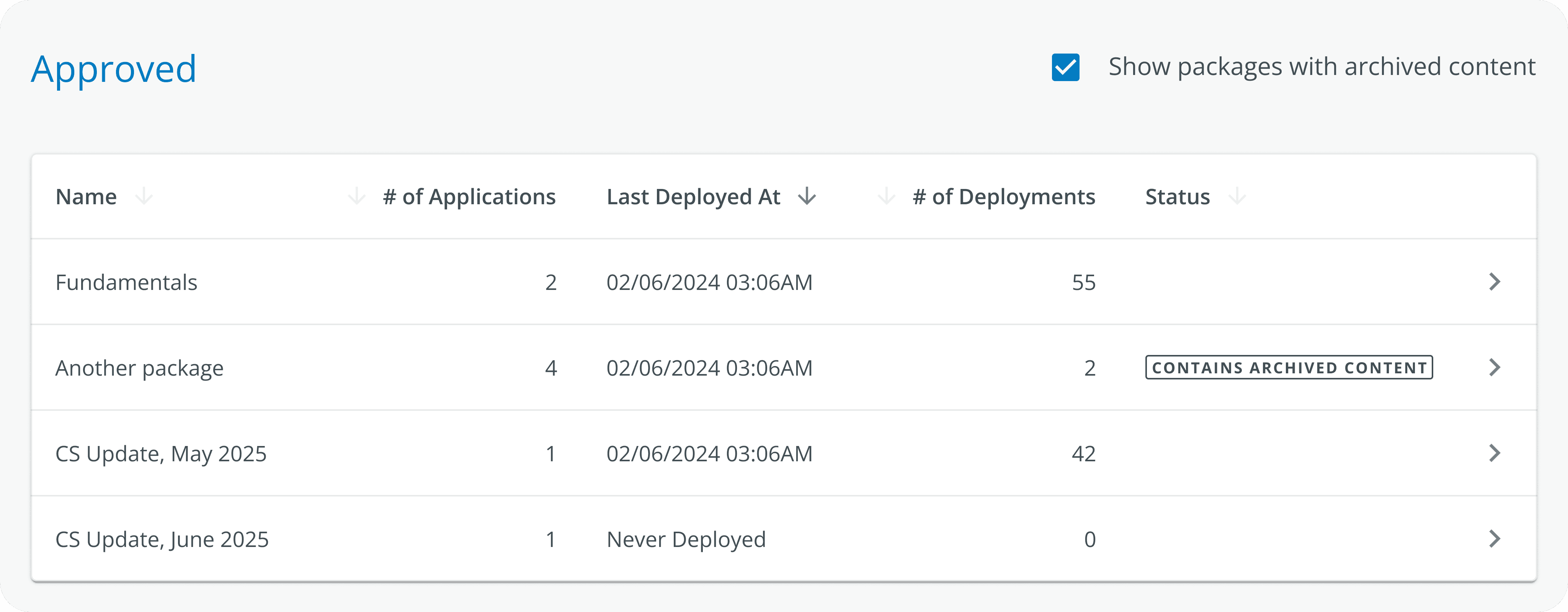
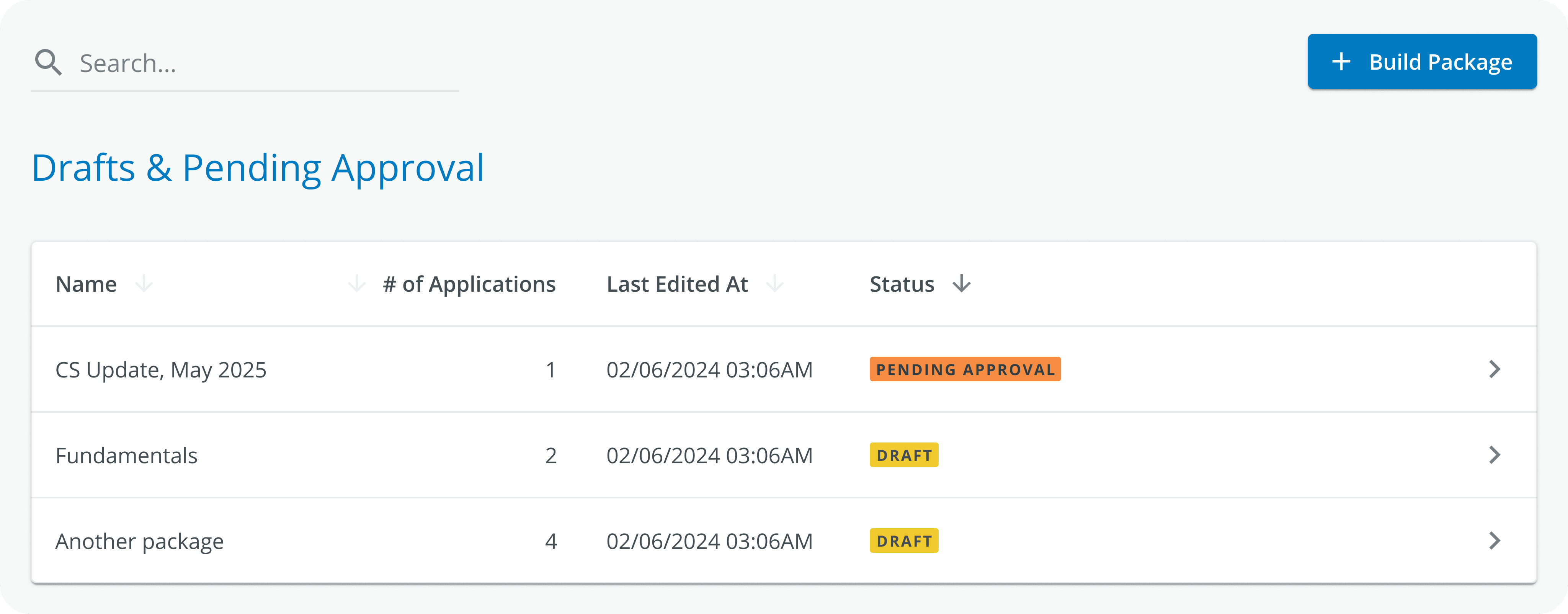
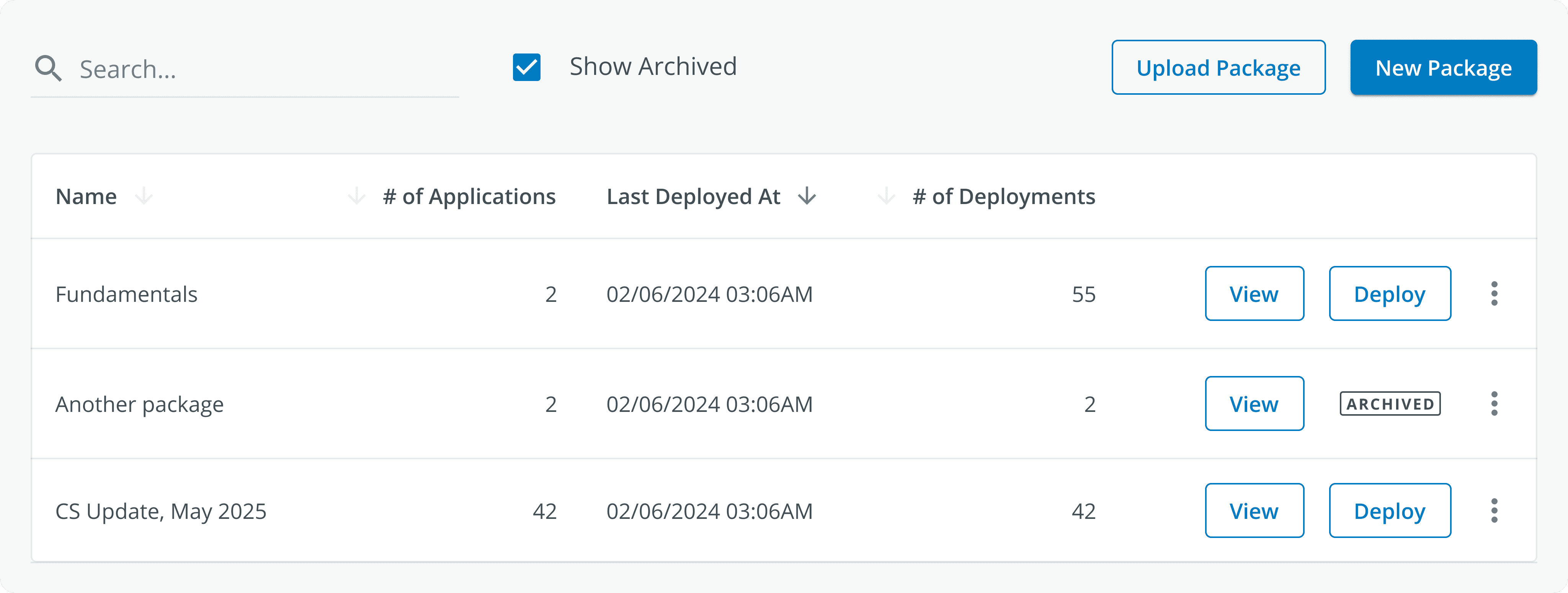
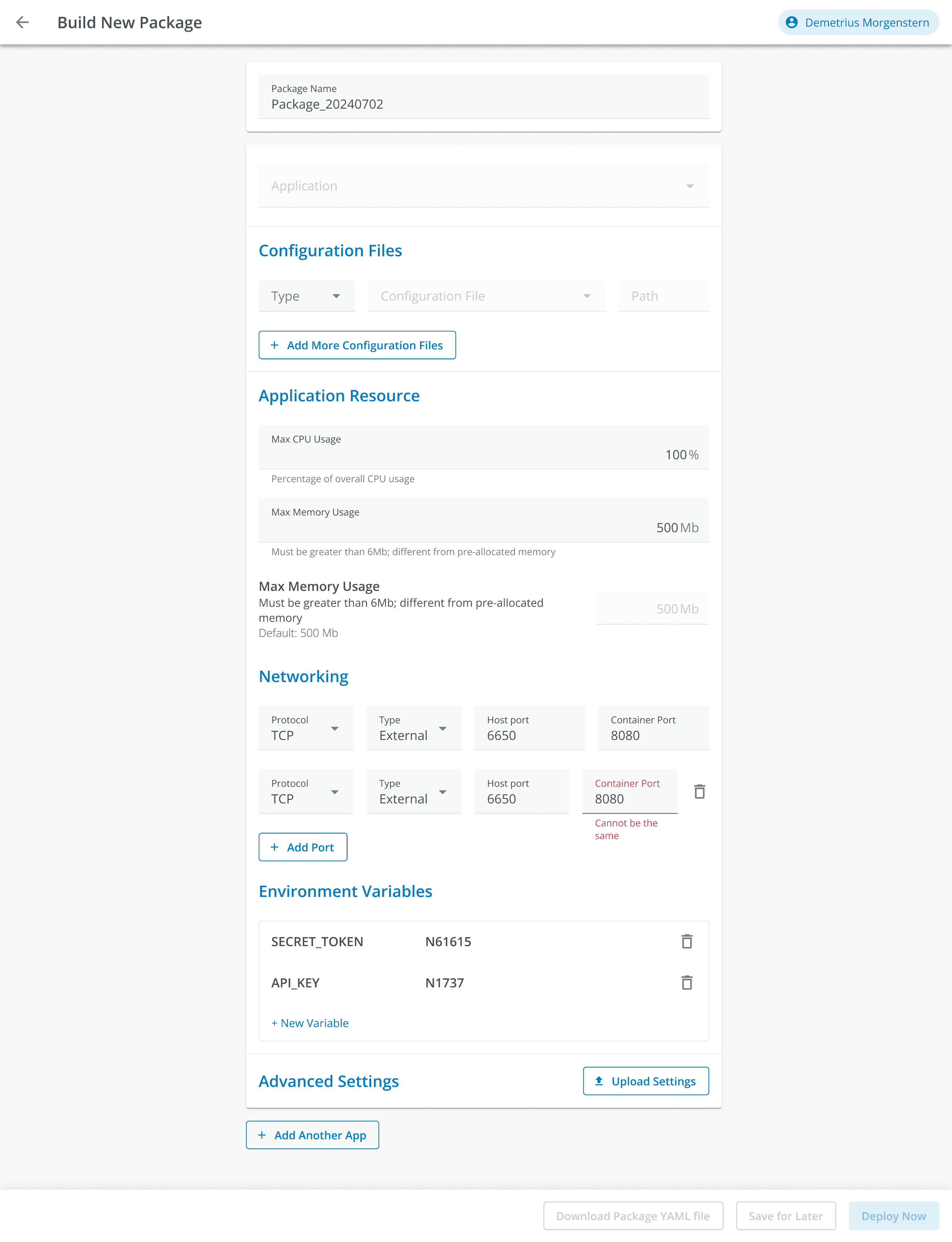
I opted for a table to display key details about each package, including the package name, number of applications, last deployment time, and number of deployments. If a package has more than five apps, a “+X more apps” link keeps the view tidy. Users can quickly deploy packages with a “Deploy” button, and create or upload new ones with “New Package” and “Upload Package” buttons at the top. A search bar and “Show Archived” checkbox help filter and find specific packages, making package management more efficient.

PM
ENG
Design Lead
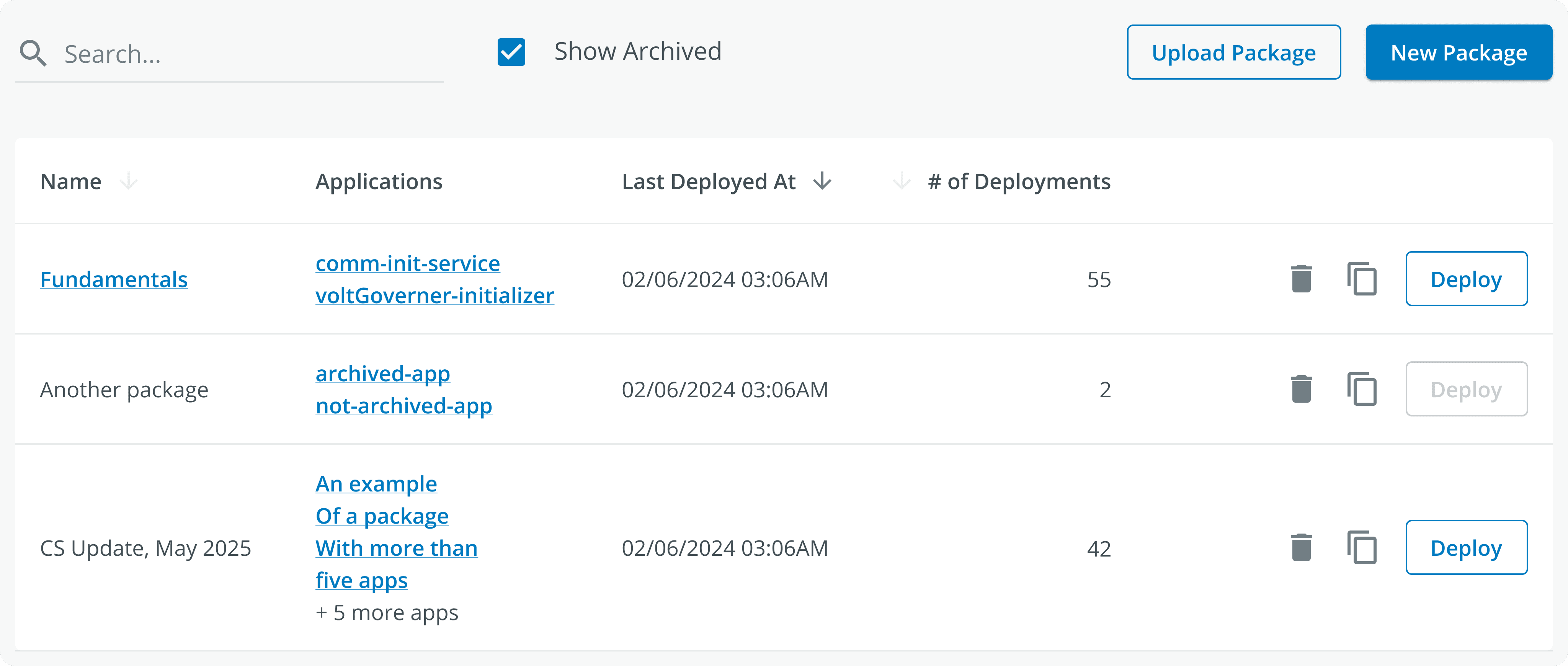
Does this mean it is clickable or is it a draft version of the package? It should be more obvious when displaying the status of the package.
The number of applications in each package will always be greater than or equal to one, so it seems unnecessary to list the names of all the applications.
Too many buttons here maybe cause the user confused or accidental click.
Iterations
Design Options
Experiment 1
Still need think another way to show view and deploy
The problem of unclear package status has not been solved yet
Change the application name to the specific quantity
Experiment 2
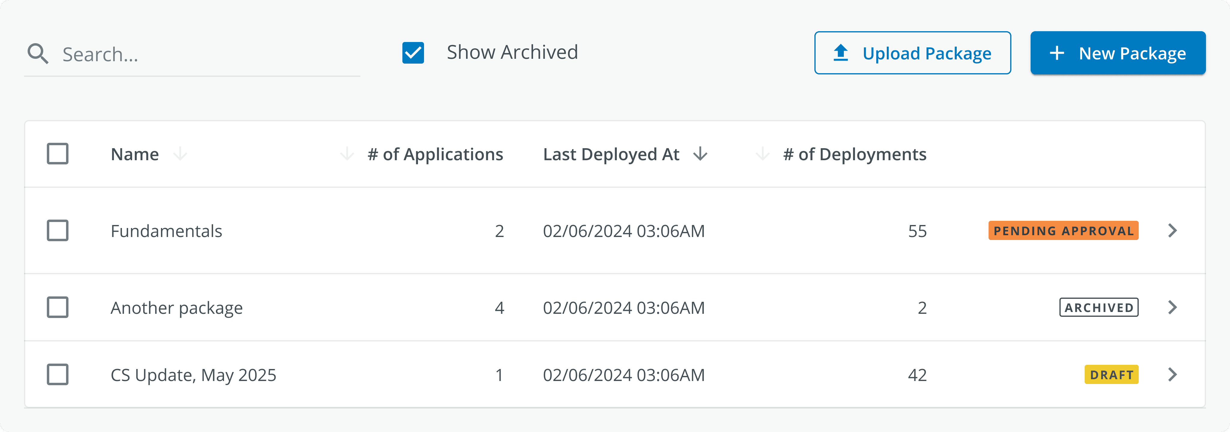
When user click the checkbox, the view and deploy button will pop up, so slove the another way to show “view“ and “deploy” this problem
But there are too many tags, and it is difficult to distinguish between approved packages and unapproved ones.
It shows the different status of package, make it more clearly to manage.
Iteration
Final Design
Concern
Check with PM
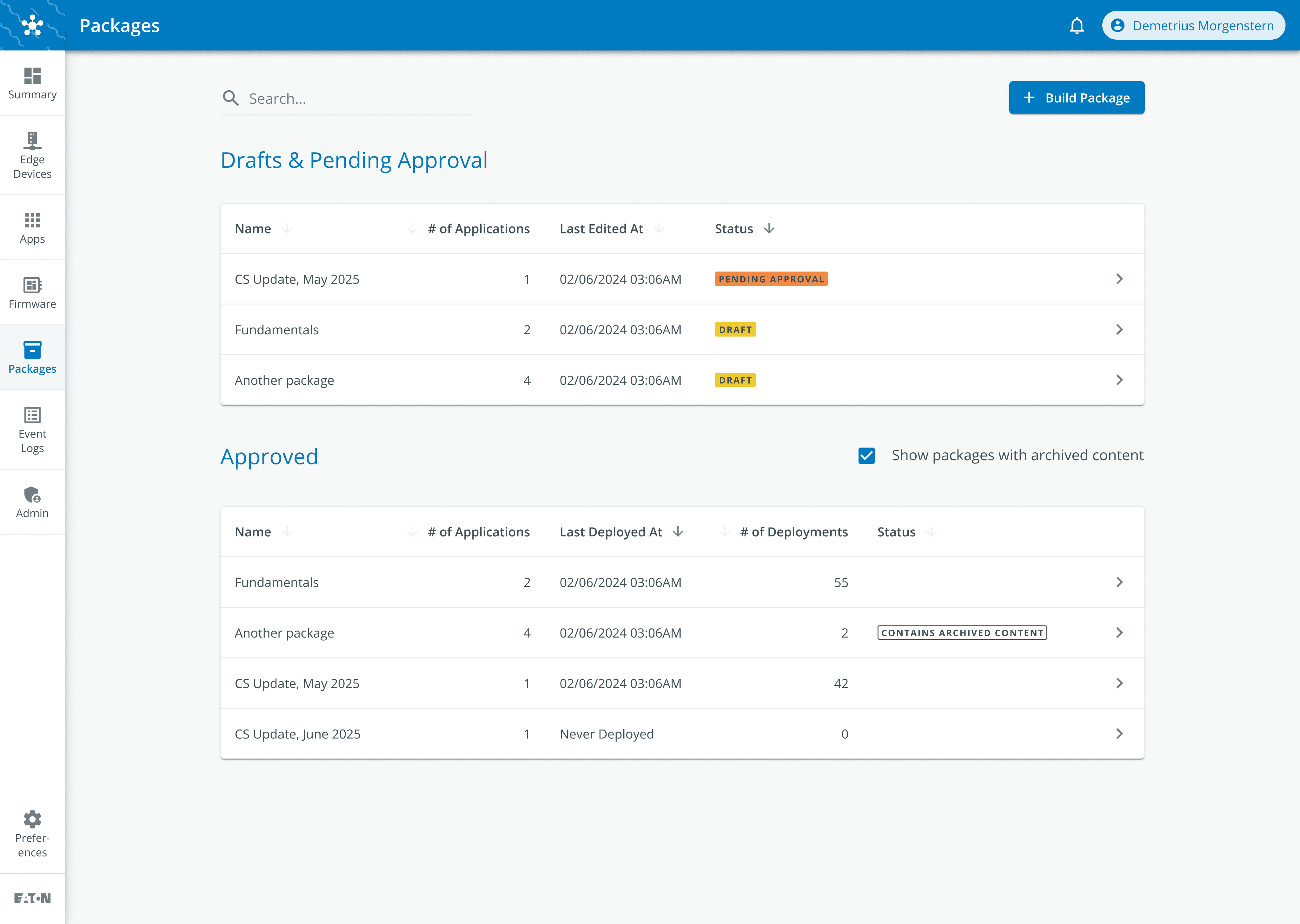
It not only shows the different status of package, but also separate the approved and drafts&pending approval states, more clearly for the opreator
But if there are a lot of packages in the drafts & Pending approval, users will not see approved packages on this page
Usually the operator will don’t have a lot of drafts, and the approval from the Supplier is really quick
User Needs 2
As a Operator, I want...
Operators
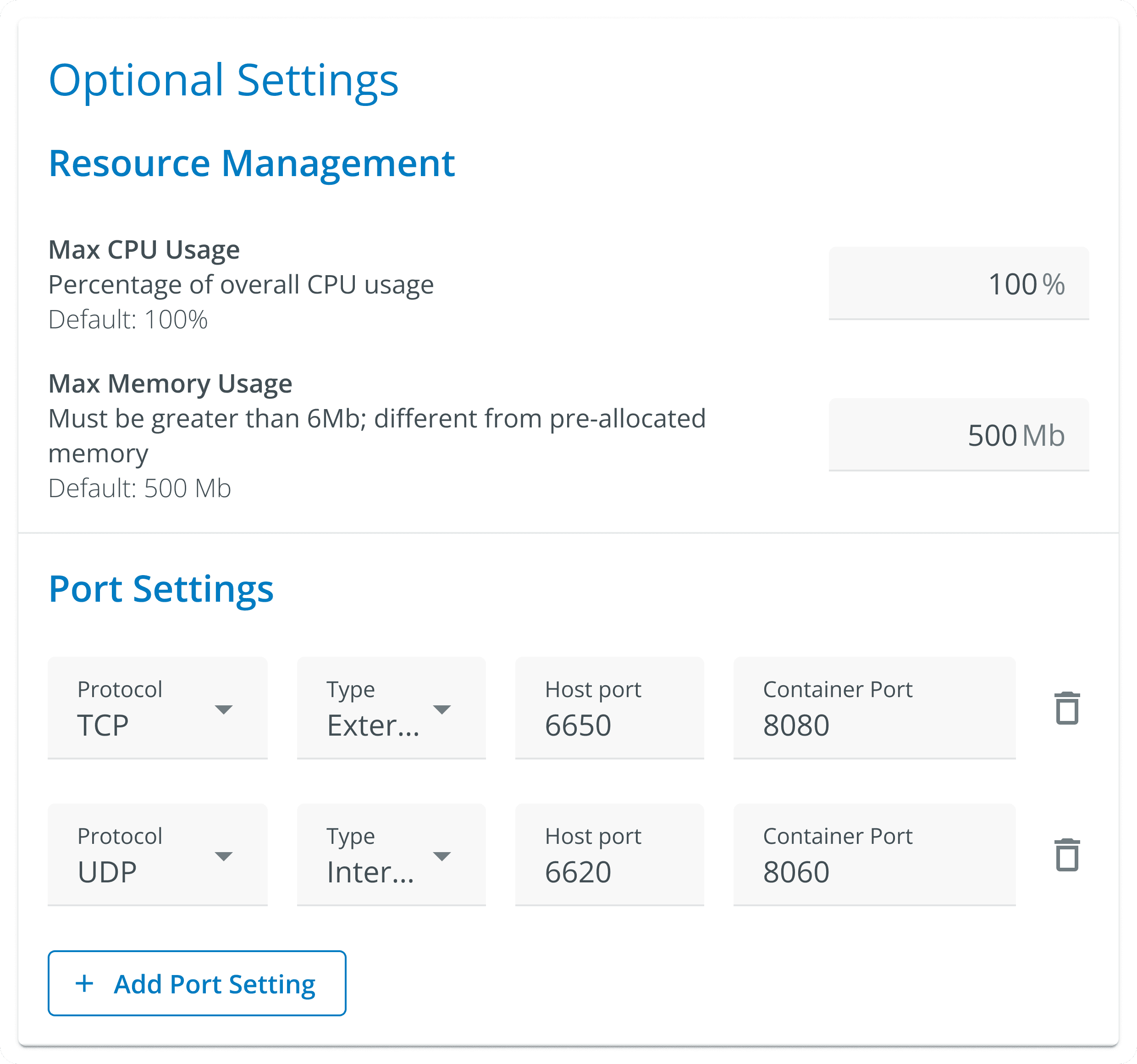
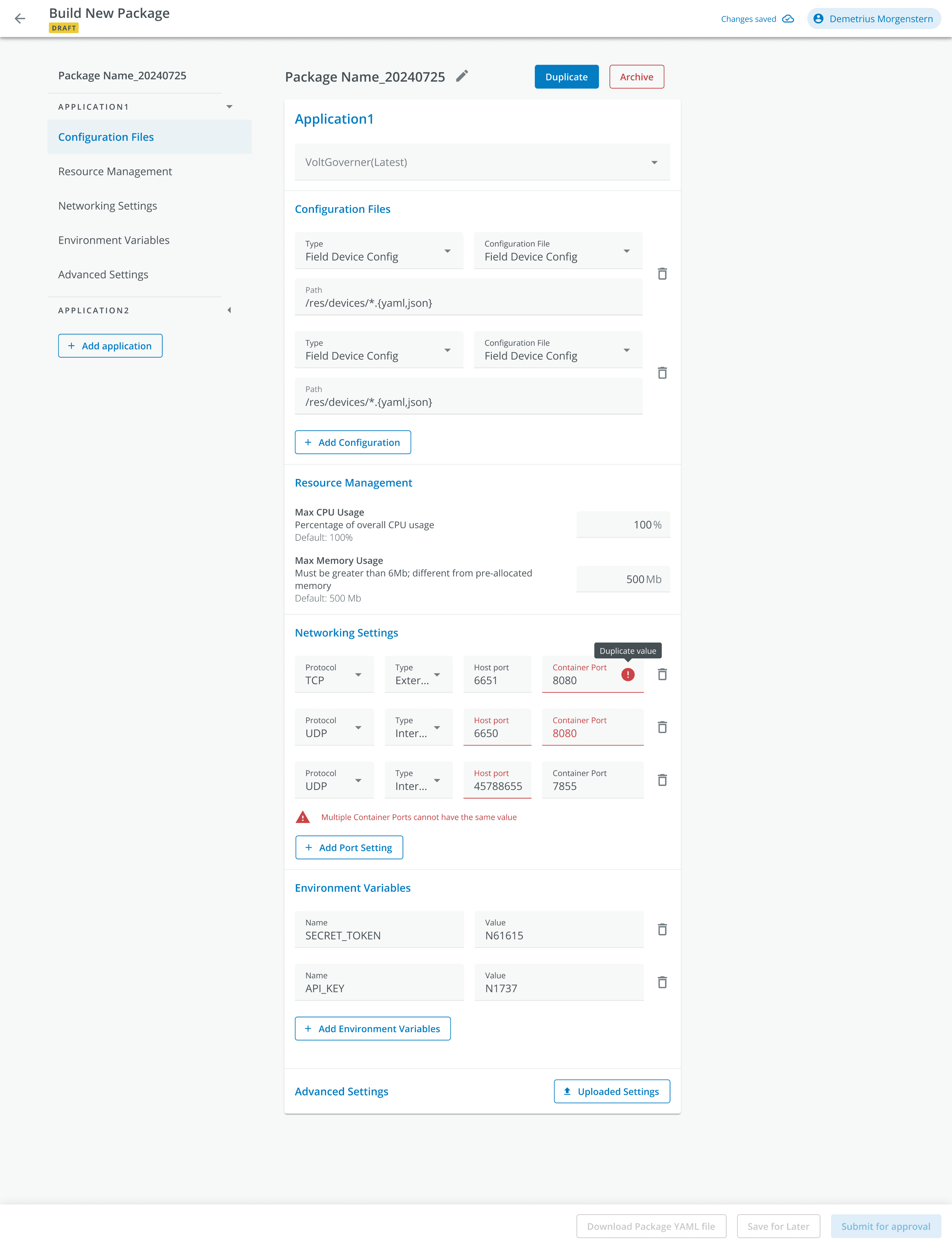
I want to configure and manage applications by customizing files, including some optional settings, like resource limits, and managing port settings, environment variables. I also expect advanced settings for more complex configurations in the future.
Design
Design Options
Experiment 1
PM
ENG
Design Lead
There is no visual consistency among these three. They need to be unified.
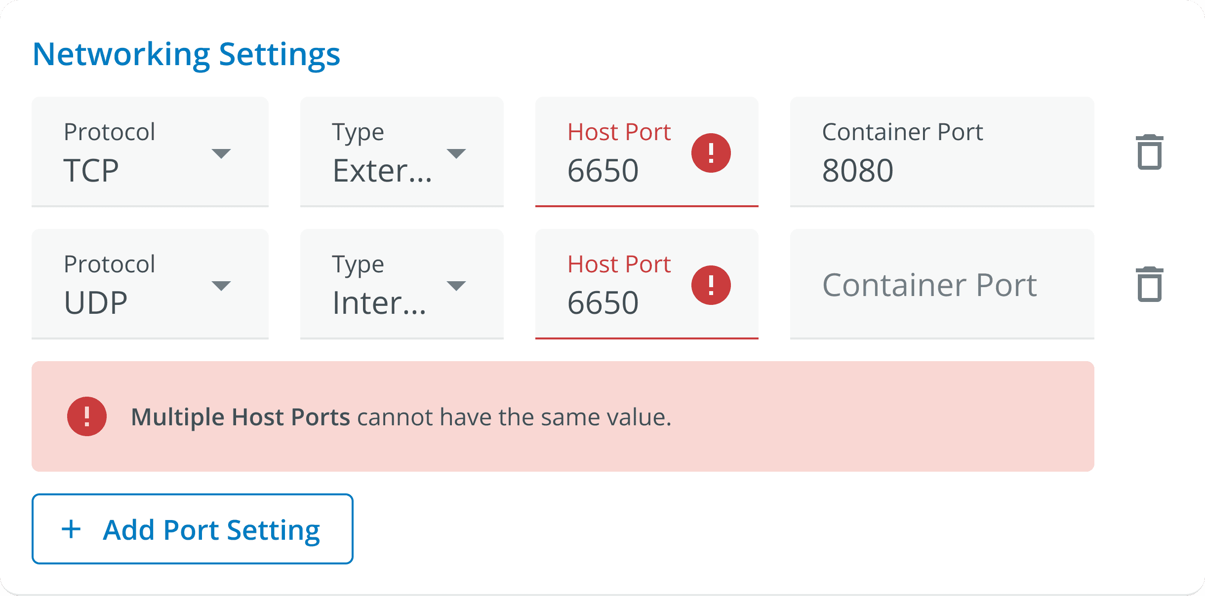
What if the user has multiple errors?
Host Port cannot be the same value too
Because the form is too long, the user is likely to time out, so an auto-save function is needed
If the user wants to add a new application, will the form be too long?
Experiment 2
Explore more error states
Resource Management, Network Settings and Environment Variable are optional for the application, so need to organize the hierarchy.
For complex or multi-step forms, users may need to submit or save frequently so button in here may require users to scroll frequently, causing inconvenience.
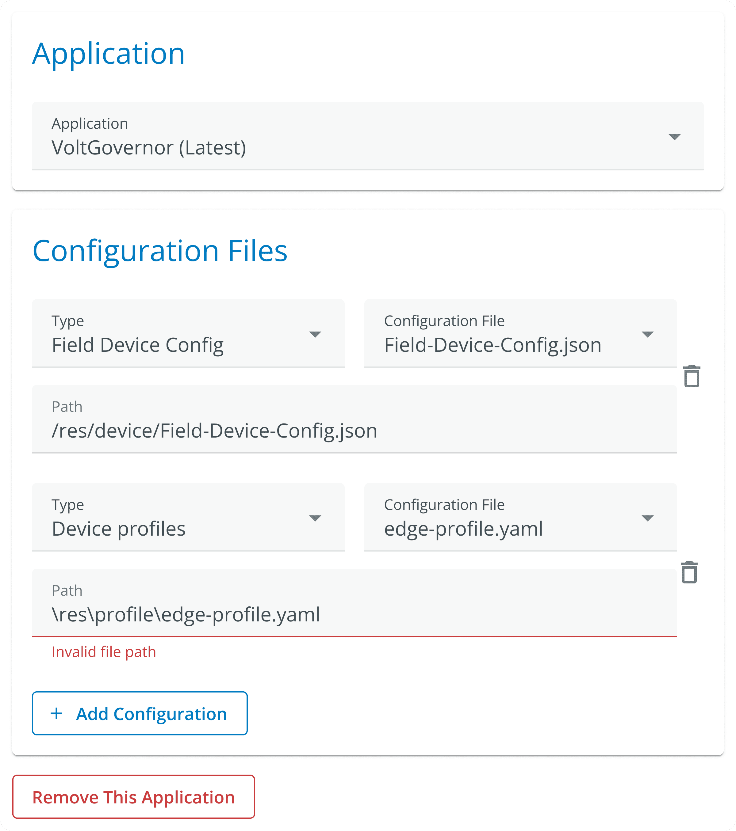
Exploration of Error States for Networking Setting
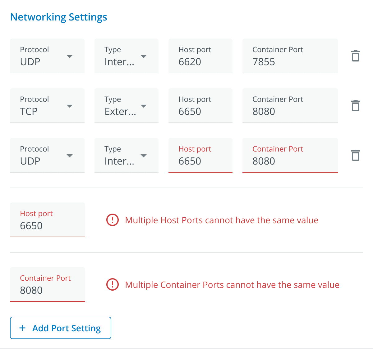
The exclamation mark icon is used beside the error messages, but it does not appear beside the input fields. This could be an additional visual indicator to help users quickly find where the issue is.
The "Host Port" for TCP and UDP protocols both use 6650, but this information is not immediately clear to the user because the fields are separated by another row.
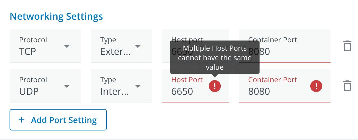
The message “Multiple Host Ports cannot have the same value” appears in a tooltip, which only shows up when the user hovers over the icon. This might not be intuitive enough for some users.
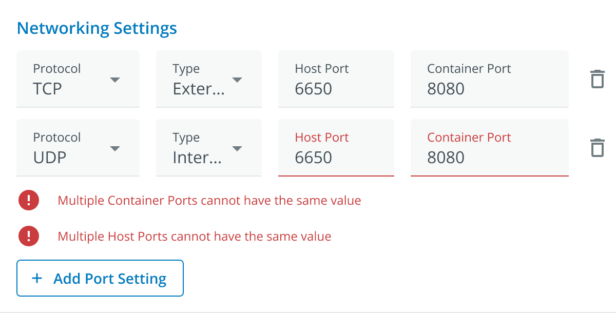
While the erroneous fields are marked with red text, this might not be prominent enough.
The soft red background behind the error message also helps it stand out without being overwhelming.
The use of red for the error icons, text, and border around the problematic fields makes it easy for users to quickly see what needs attention.
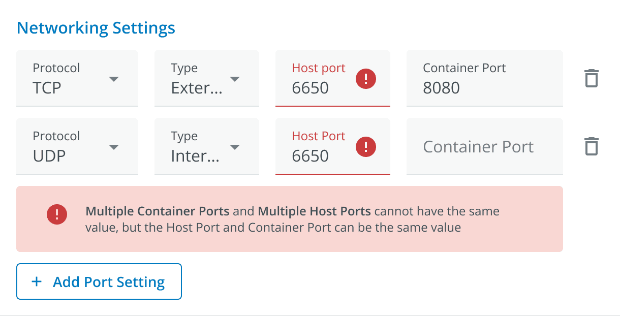
Iteration
Final Design
Error States
Reorganized the information structure, with clear Section Separation, making it easy for users to navigate through various configuration areas without feeling overwhelmed.
The button is moved from the bottom to the top and remains in a fixed position, making it easier for users to operate quickly.
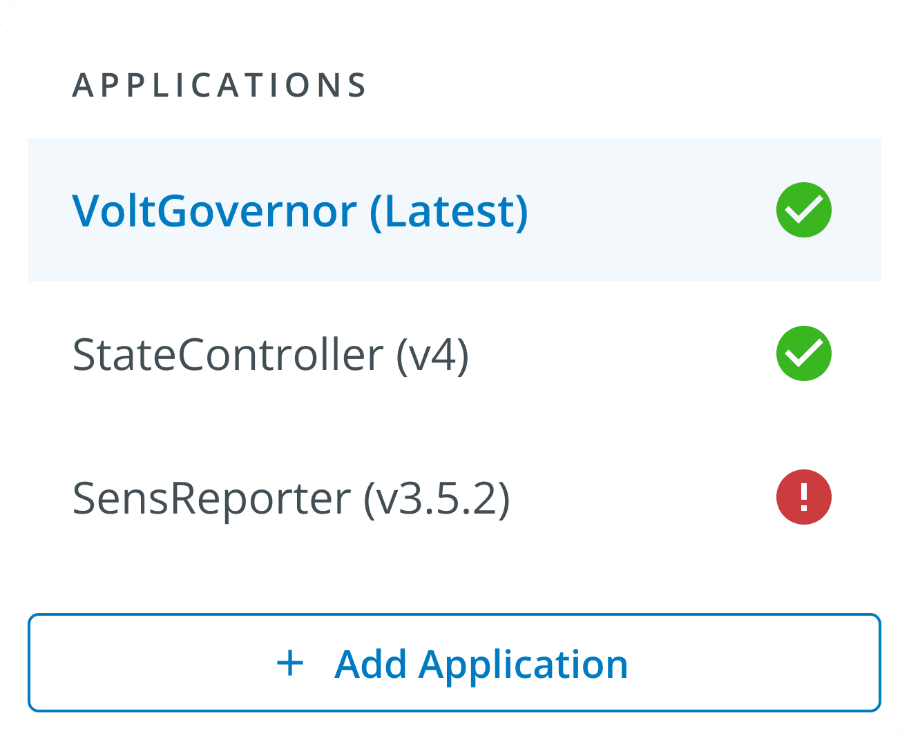
Remove the detailed content from the Sidebar, leaving only the simple application, and set different states. When there is an error state in the application, it will be displayed as an icon
*Email me for viewing full case study

United States EST
Last updated at Oct 15, 2024